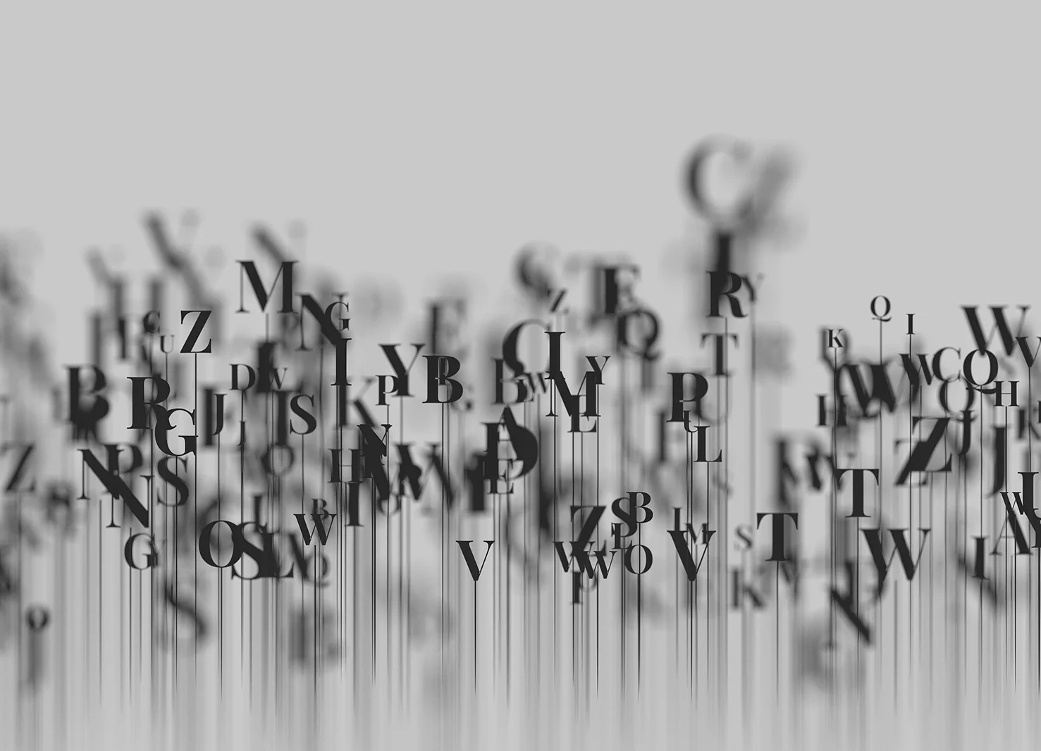
Typography: More Than Just Letters
Typography goes beyond the simple display of text and can be used as a powerful visual element in your design. It communicates the tone, voice, and personality of your brand, and can help create hierarchy, organise information, and guide a reader’s experience.
By utilising font sizes, weights and styles, you can create contrast, emphasis, and rhythm in your design. For example, larger, bolder fonts can be used to highlight important information, while smaller, lighter fonts can be used for secondary or tertiary information.
Communicating Your Brand's Personality
More than a generic list of options, different fonts possess their own unique characteristics, which when chosen with intentionality can mirror your brand’s personality.
Serif fonts, with their decorative "feet" at the ends of letters, are usually more formal, communicating tradition, reliability, and respectability. Sans serif fonts, on the other hand, are seen as modern, clean, and straightforward.
The typeface you choose can say a lot about who you are as a brand; depending on what you want to communicate, the choice of font can significantly impact how your message is perceived.
The Art of Font Pairing
Choosing the right font pairings is a delicate art that can significantly enhance your brand's visual identity. Combining fonts can create a dynamic visual hierarchy, providing clarity and improving overall readability. When selecting font pairs, it's important to consider the contrast — fonts from the same family or with similar characteristics can provide a sense of unity, while contrasting fonts can add interest and emphasise certain elements.
Using too many different fonts can lead to a cluttered and confusing design. An unspoken rule is no more than 3 typographical variations in a design, including the use of bold, italics, and underlining, to ensure effective and accessible readability, especially for those with dyslexia. The goal of font pairing is to create a balance that complements your brand and communicates your message effectively.
Consistency is Key
Consistency in typography helps to establish a strong (and lasting) brand identity. By using the same typefaces across all platforms and mediums, you create a cohesive visual identity that is recognisable and memorable. This consistency helps to build trust with your audience and works to establish your brand in their minds.
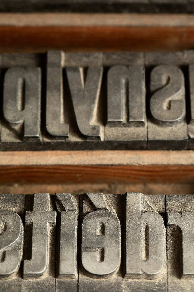
A Brief History of Typography
Typefaces are hugely reflective of the culture and aesthetics of their time. The 15th century invention of the printing press by Johannes Gutenberg allowed for the mass production of printed materials, revolutionising the spread of information and increase of typefaces.
In the late 18th century, the Industrial Revolution introduced new printing technologies, allowing greater variety and complexity in typefaces. The 19th century saw the birth of the modern sans-serif typeface, which is still widely used today.
The 20th century brought about significant changes in typography with the advent of digital technology. The development of computer software made it possible to design and manipulate type in ways that were previously unimaginable, giving typography the limitless design potential it now holds.
Tips for Effective Type
- Readability is key: make sure the font is easy to read in different sizes and on different platforms
- Check the versatility of the font: you want a font that looks good in both print and digital, and in a variety of applications, from your website to your packaging
- Font unity: if you’re using multiple fonts, do they speak together as a whole to authentically reflect your brand?
- Type hierarchies: remember, type hierarchies exist for both visual and technical organisation, so don’t neglect this when using your chosen typefaces on digital platforms
- Pairing fonts together: try not to overcomplicate it, but also don’t be afraid to experiment with font pairings, sometimes a bit of play is needed to find the right balance
- Be consistent: stick to your chosen fonts across different platforms to maintain a unified brand presence
The power of typography lies in its ability to subtly communicate your brand's essence. It's an art form that, when done well, can make a significant difference in how your brand is perceived. Don’t neglect typography as an afterthought; utilise it as a powerful design tool.