Brand refresh to match the company's growing ambition.
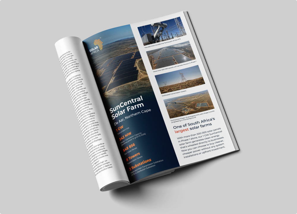
A brand refresh that gave a long-standing identity the clarity and confidence to match the company's growing ambition.
The brief
SolarAfrica is a leading South African provider of energy solutions for businesses; solar, storage and beyond. Kelly Agency has supported the brand for over ten years across design and website requirements.
The brief for this project was a visual identity refresh: not a rebrand, but a considered uplift that would bring more clarity, confidence and consistency to the way the brand shows up. The logo and colour palette were to remain untouched; preserving the equity and recognition built over time, but the system around them needed to work harder and feel more contemporary.
Client
SolarAfrica
Industry
Renewable Energy
Services
Year
2025
Same brand, sharper system, ready for wherever the business goes next.
The thinking
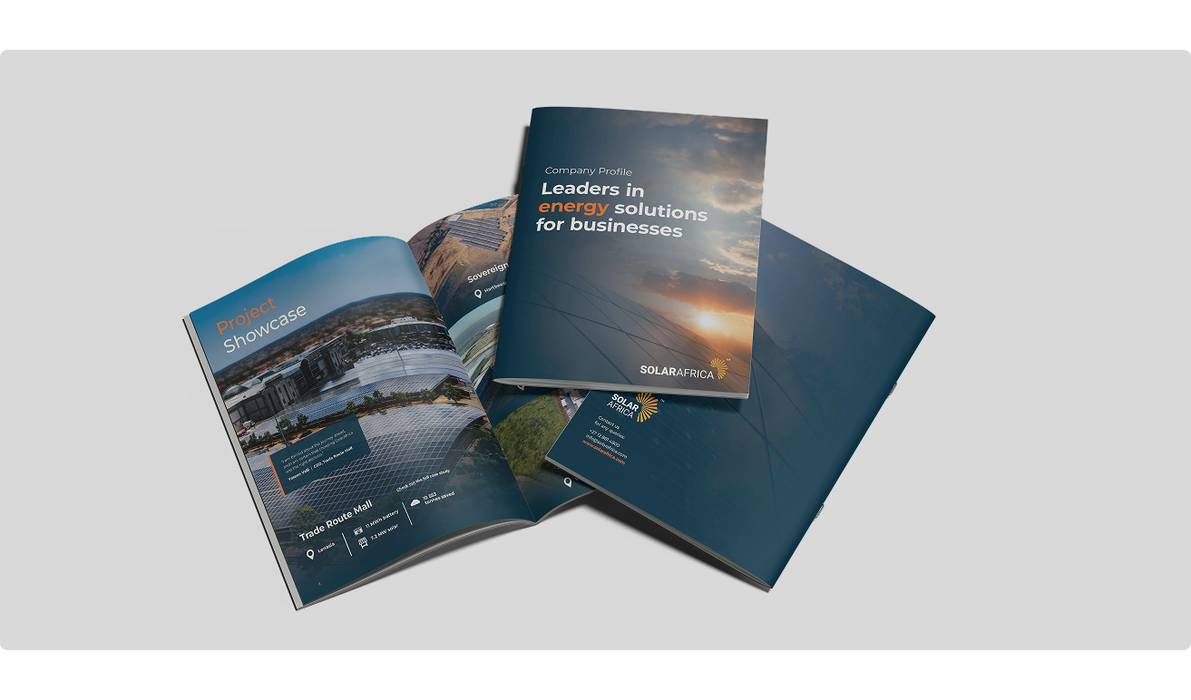
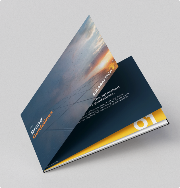
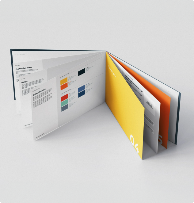
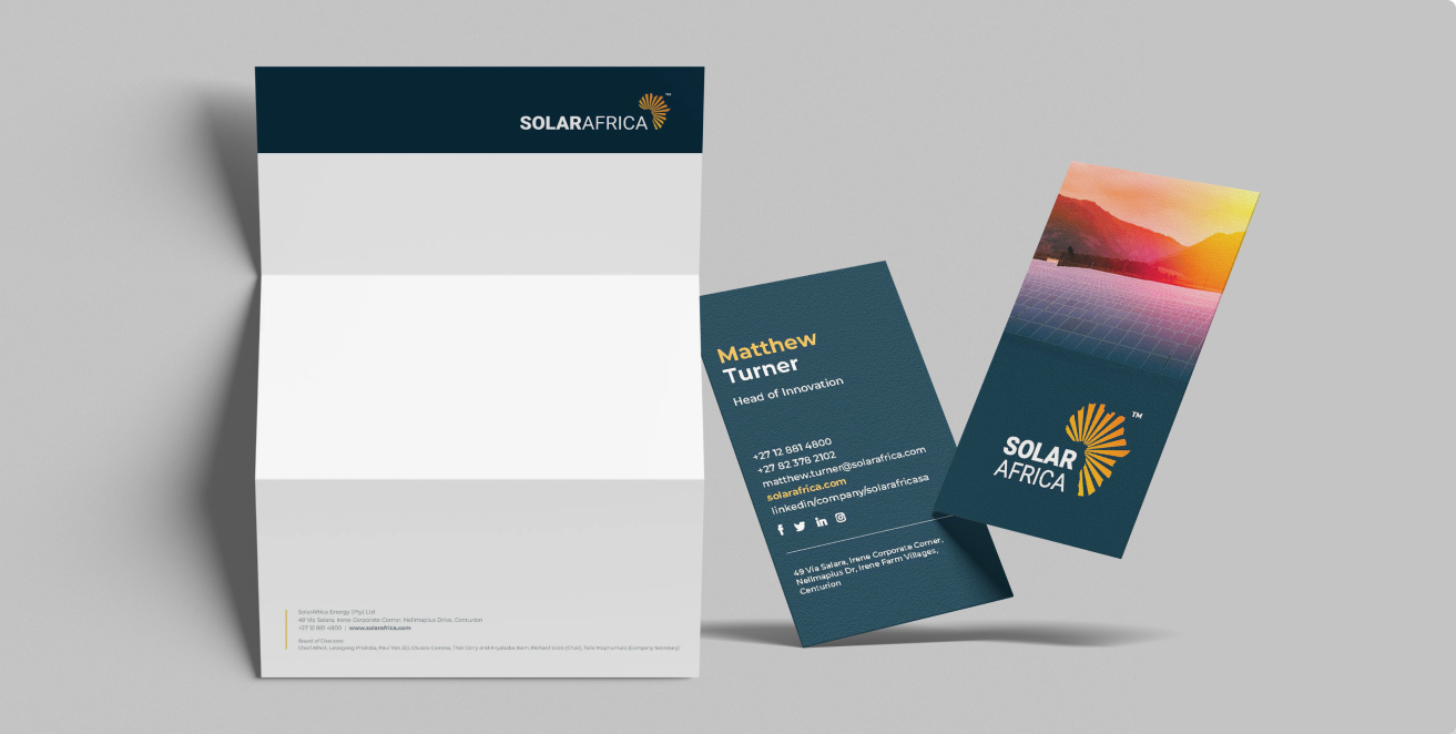
The existing brand had all the right ingredients but lacked a clear hierarchy. The refresh established a stronger primary/secondary colour split; yellow, orange and dark blue taking dominance, with the remaining colours stepped back to a supporting role. The second key decision was introducing a blue gradient overlay as a consistent image treatment, unifying photography across all touchpoints while maintaining legibility. Together, these two moves gave the identity a coherent, ownable visual language without redesigning anything from scratch.
Design process
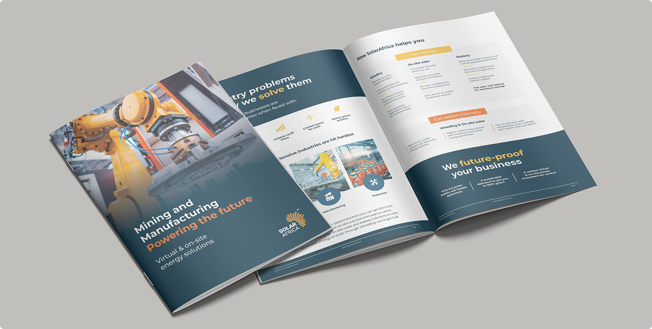
Kelly Agency worked through the brand framework first, refining the archetype, key messaging and application rules, before codifying the updated system across colour hierarchy, gradient usage, logo lockups, typography and photographic style. Everything was captured in a comprehensive set of brand guidelines to serve as the reference for all future applications, then rolled out across all marketing collateral and touchpoints.
The outcome
The refreshed identity gives SolarAfrica a visual system that feels more purposeful and polished, while remaining recognisably the same brand. The gradient overlay in particular creates a distinctive, repeatable look across photography that ties all communications together. With clear guidelines in place, the brand can now be applied consistently across every touchpoint; from digital to print, with confidence and without ambiguity.
Kelly has a fantastic eye for creativity and design with great attention to detail. Working remotely poses certain challenges but this has never been an issue, every brief is addressed 100% and completed in exceptional turnaround times with minimal changes. Our designs are always innovative and continue to develop bringing an element of life to what could be seen as a boring brand. We could not be happier with the quality and level of work.